Project Spotlight: Whistler Atlanta, GA
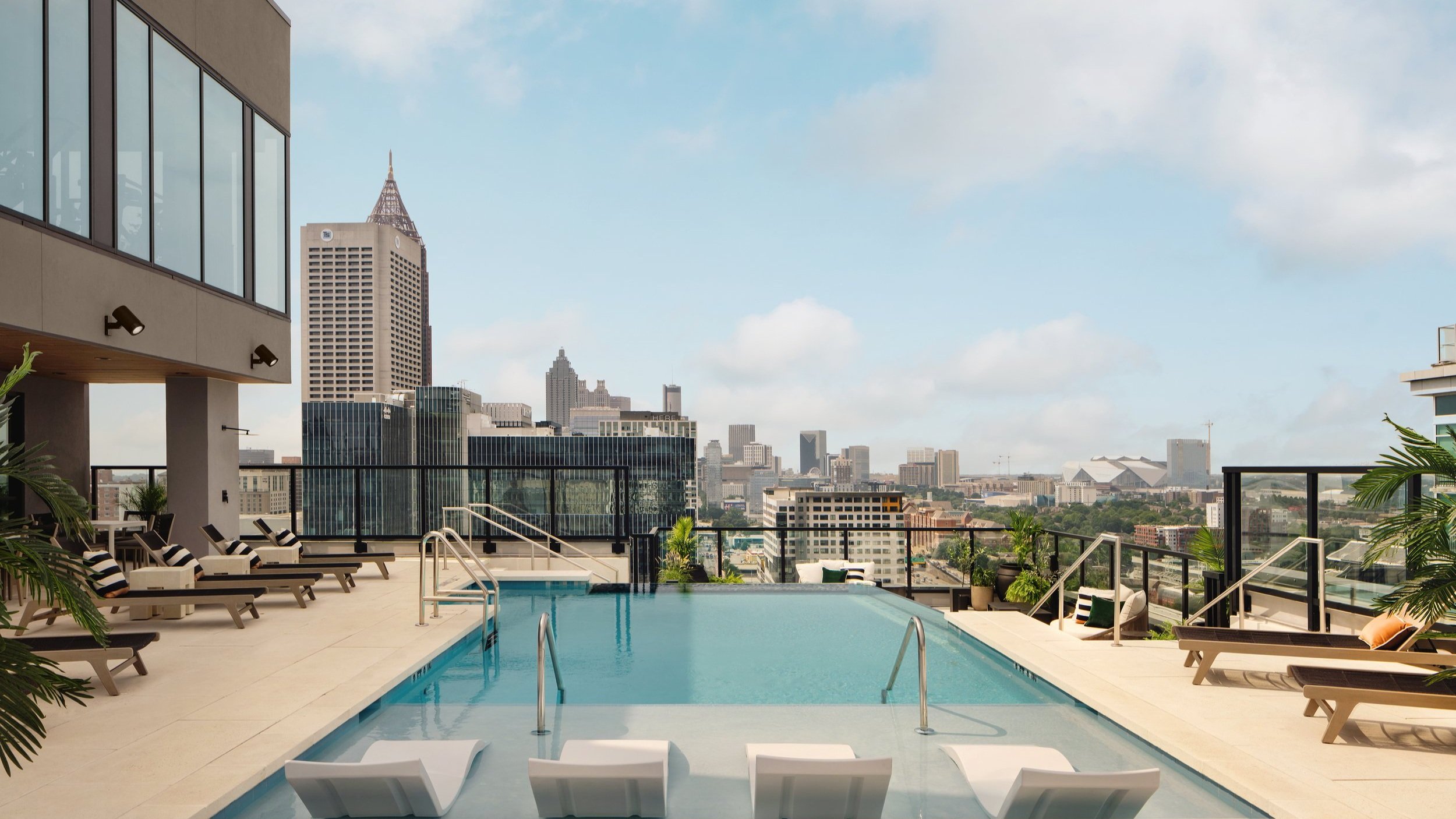
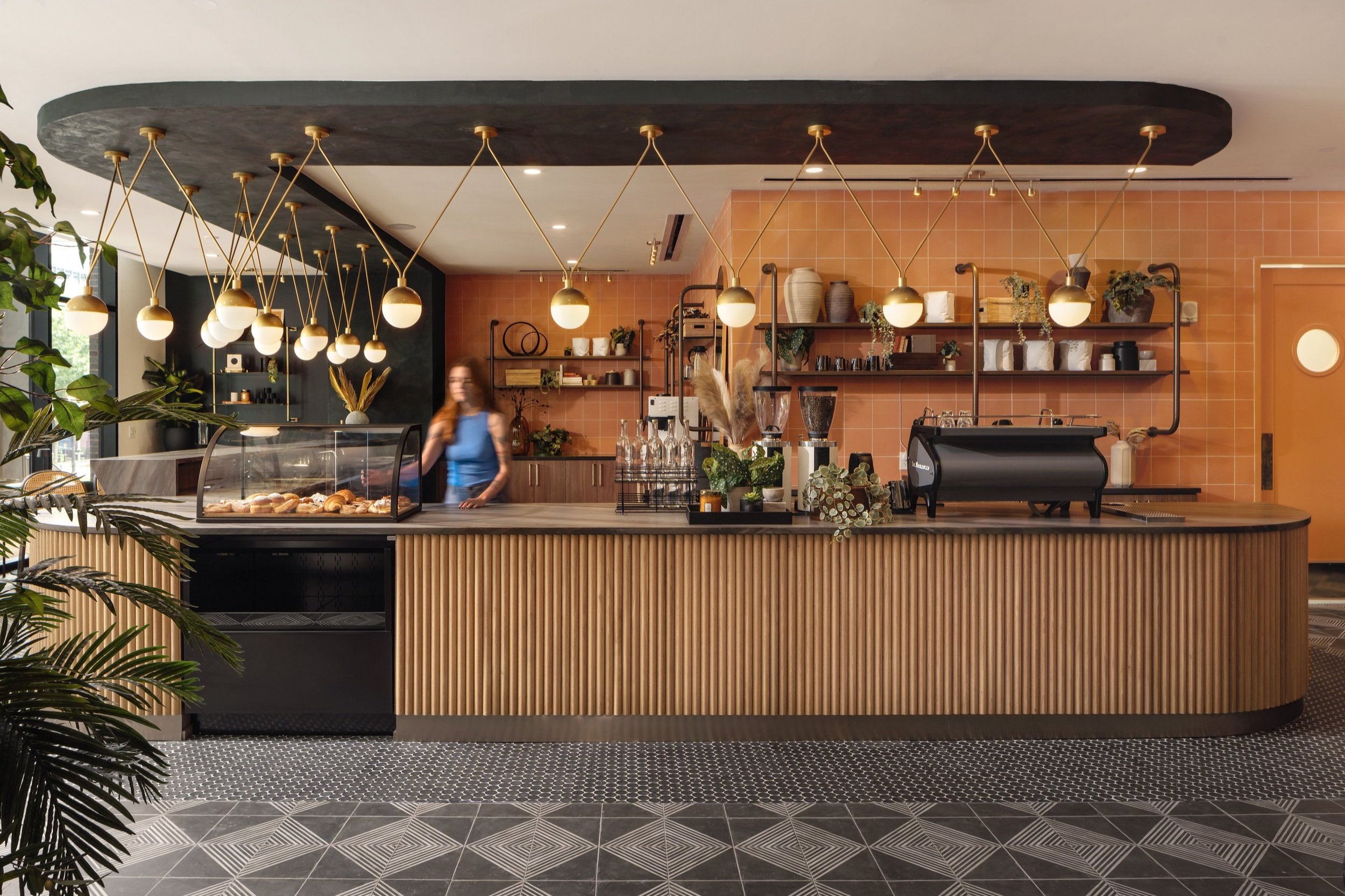
Within walking distance of Georgia Tech’s campus, Whistler is a 25-story, luxury off-campus student housing development and the latest addition to Tech Square, Midtown Atlanta’s hub for startups, tech companies and research centers. The 565-bed community features 168 apartments, penthouse units, and 17,300+ square-feet of boutique-style amenities. Students can treat themselves to craft coffee and artisan pastries at the on-site Daydreamer café, exercise in the expansive fitness center, or lounge poolside on the rooftop deck while enjoying panoramic skyline views.
When you can’t build out, build up. This thoughtfully considered tower is designed to take full advantage of its half-acre footprint at 859 Spring Street. A design/build delivery with LV Collective as the client and JE Dunn Construction as the general contractor, Niles Bolton Associates worked with the collective team through early analysis and density studies to arrive at the right unit mix. Whistler sits on the SPI-16 zoning ordinance, which encourages minimizing the amount of vehicular parking and increasing the use of alternative modes of transportation and mobility. The team worked with Midtown Alliance and the DRC to meet their requirements and deliver a project the city could be proud of.
From rendering…
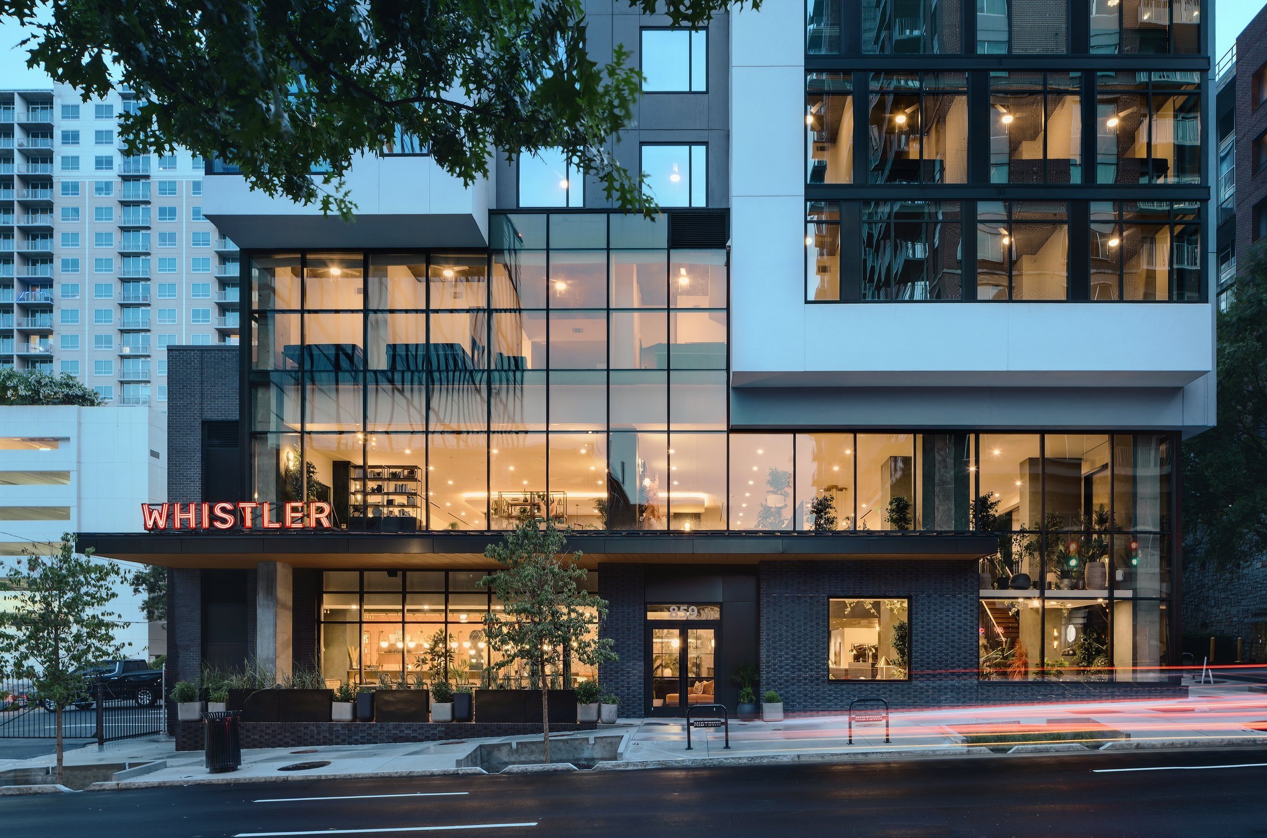
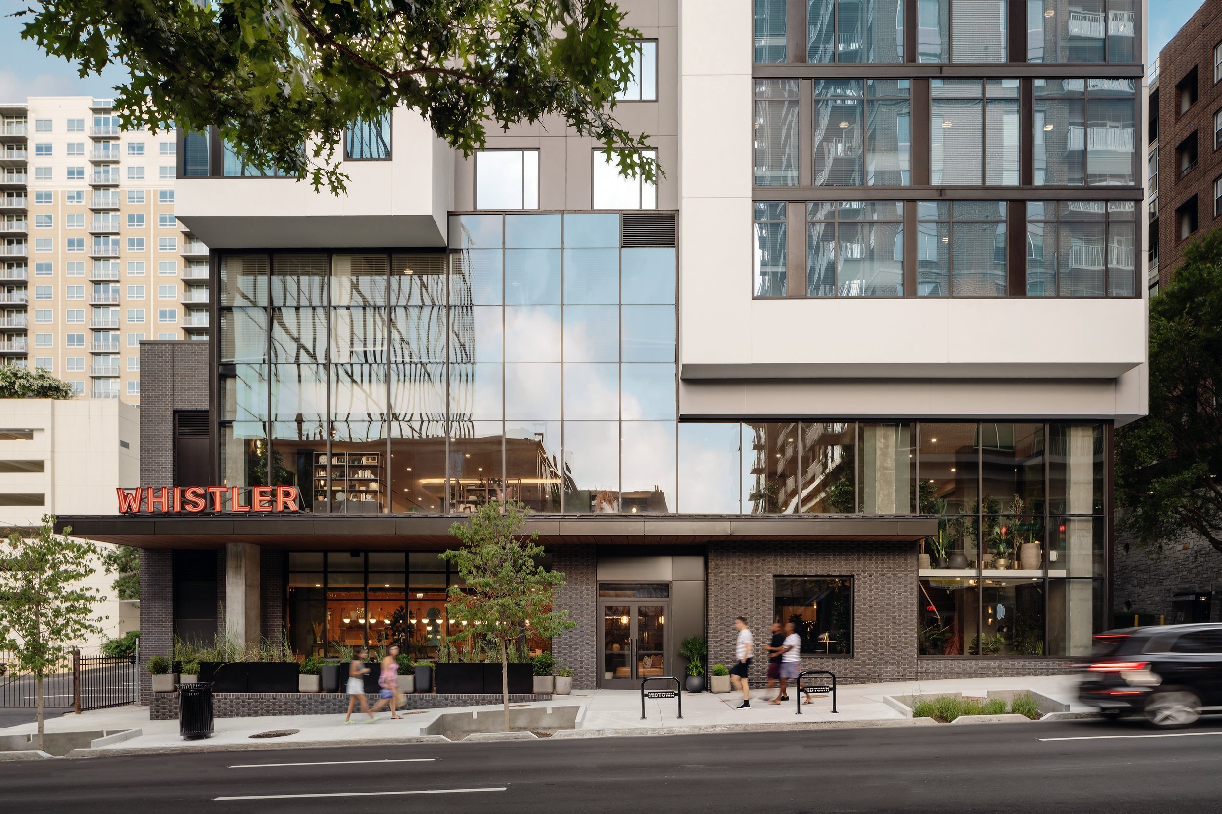
…to reality!
The entire 284,839-square-foot property is served with one level of basement parking totaling 25 spaces—an amount unheard of for a project this size. After working through multiple iterations, the initial five levels of parking were cut to one basement level accessed from Abercrombie Place. “LV Collective being comfortable enough to cut the percentages down to 25 spaces surprised the team in the beginning,” said Principal Mohamed Mohsen. “Just thinking about where we are in Midtown, the continued reliance on biking, walking, and scooters, Tech across the highway and expanding on this side of Spring with new buildings in the future, and being on a MARTA line with proximity to the stations—all of that solidified the decision. It’s taking a risk, because no one else has done it, but it’s a calculated risk because we continue to move away from reliance on cars. The zoning and design review committees were thrilled to see we had minimum parking.” Along with parking, the site also offers residents a bike storage room with over 50 spaces.
Once the parking was solved, another challenge emerged—modifying the building’s base design. “When we lost all five parking levels, we lost the base that had grounded the building, and we had to work through the overall concept to figure out how to reintroduce something to ground it,” said Associate Principal April Tann. “We joked about the first iterations feeling like somebody hammered the building into the ground. We had this sliver of a base that no matter what we did it just felt proportionally not tall enough.” The team asked themselves: How can we redesign the base in a way that gives the illusion it has sufficient height to support this tall tower above it? The pedestrian’s perception was also considered, and what the building would look like to them up close and far away.
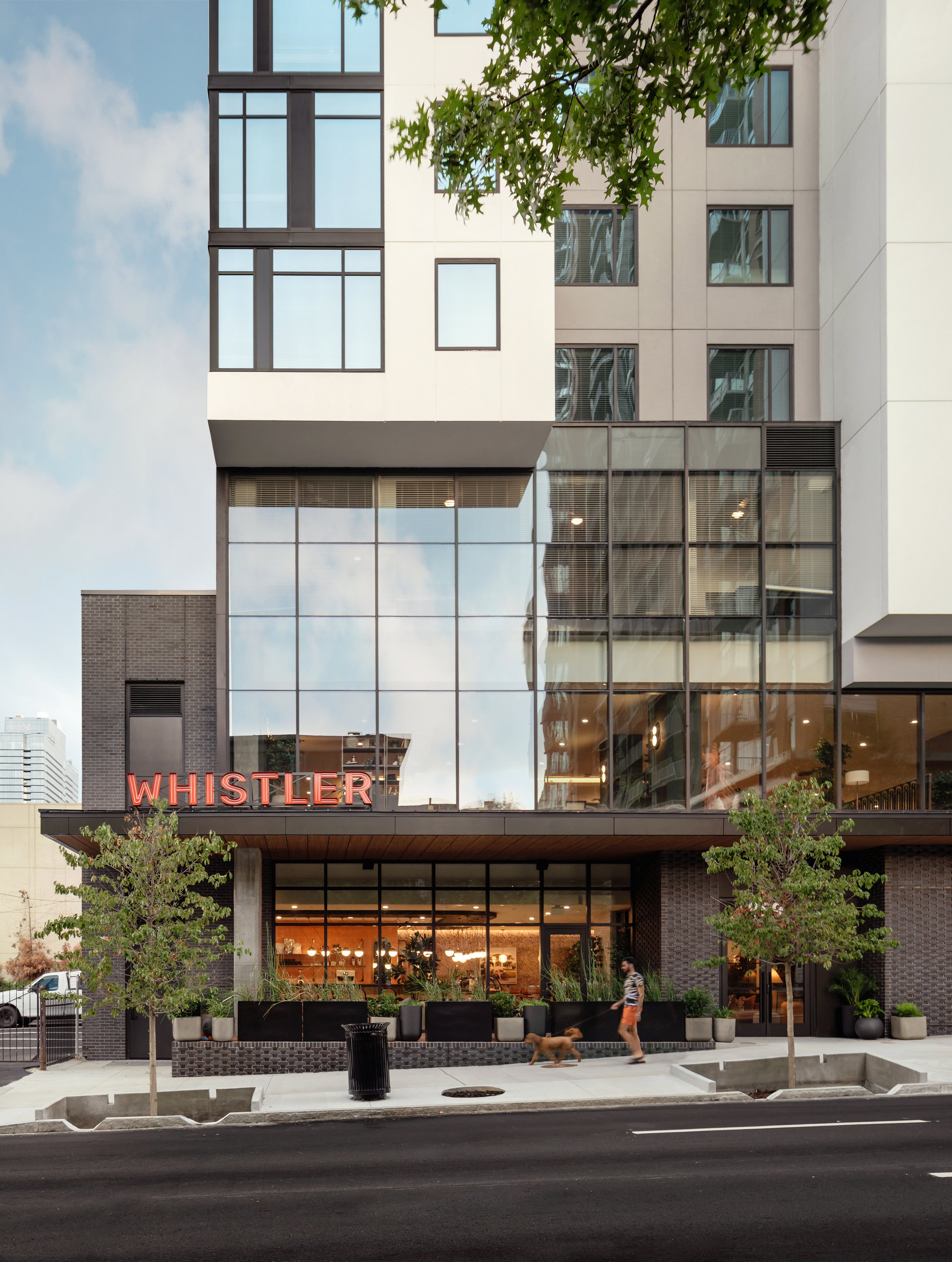
The solution was a sleek, dark grey brick base, but instead of the masonry conventionally running from edge to edge, the brick is patterned and recessed in some areas, creating secondary textures that look like a varied finish without using different materials. A double height lobby and mezzanine visible to the public animates the street both day and night, bringing life to the corner of Spring Street and Abercrombie Place. The design of the floor-to-ceiling windows and vertical mullions draw attention to the base, making it appear taller than it really is. “The idea is at night, with amenities stacked on the first levels, the space will glow with activity to help engage the sidewalk and create a connection between inside and outside,” said Mohsen. A bold, orange Whistler sign installed at the edge of the canopy along Spring lights up at night and gives the base a nice finishing touch.
When looking at Whistler from a distance, the massing has a main body—a mid-grey tone that rises and eventually forms a clean rectangle at the top with “mini towers” off the corners. “This is the smallest site our team has ever done, and we maximized every corner of the building,” said Tann. “The general design concept was to have these slender, mini towers slightly offset from each other to make the façade look and feel dynamic instead of a static block.” The team also carved out balconies at several locations instead of having them run from top to bottom, a rhythm of every three levels that shift going up the building to reinforce that sense of movement and break up the vertical repetition often seen in high rise buildings. “Normally when you have these tall buildings sitting on one or two levels of base it tends to be perceived as top heavy,” said Mohsen, “but by introducing subtle façade shifts at the lower levels, the team was able to balance the overall massing, help ground the building and provide for a more comfortable transition between the lower amenity levels and the residential above. How the base turned out, knowing it all started with a design challenge, has become my favorite part of the project.” The building’s skin is made from a Prefabricated Acrylic STO Panel by Southern Wall Systems (SWS). The team started working with SWS early in the process which helped reduce time on construction.
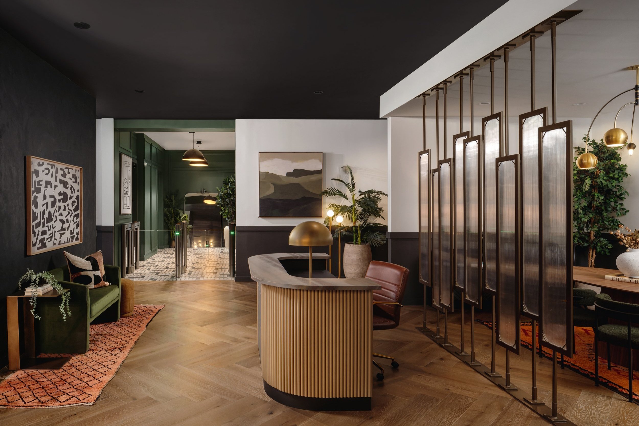
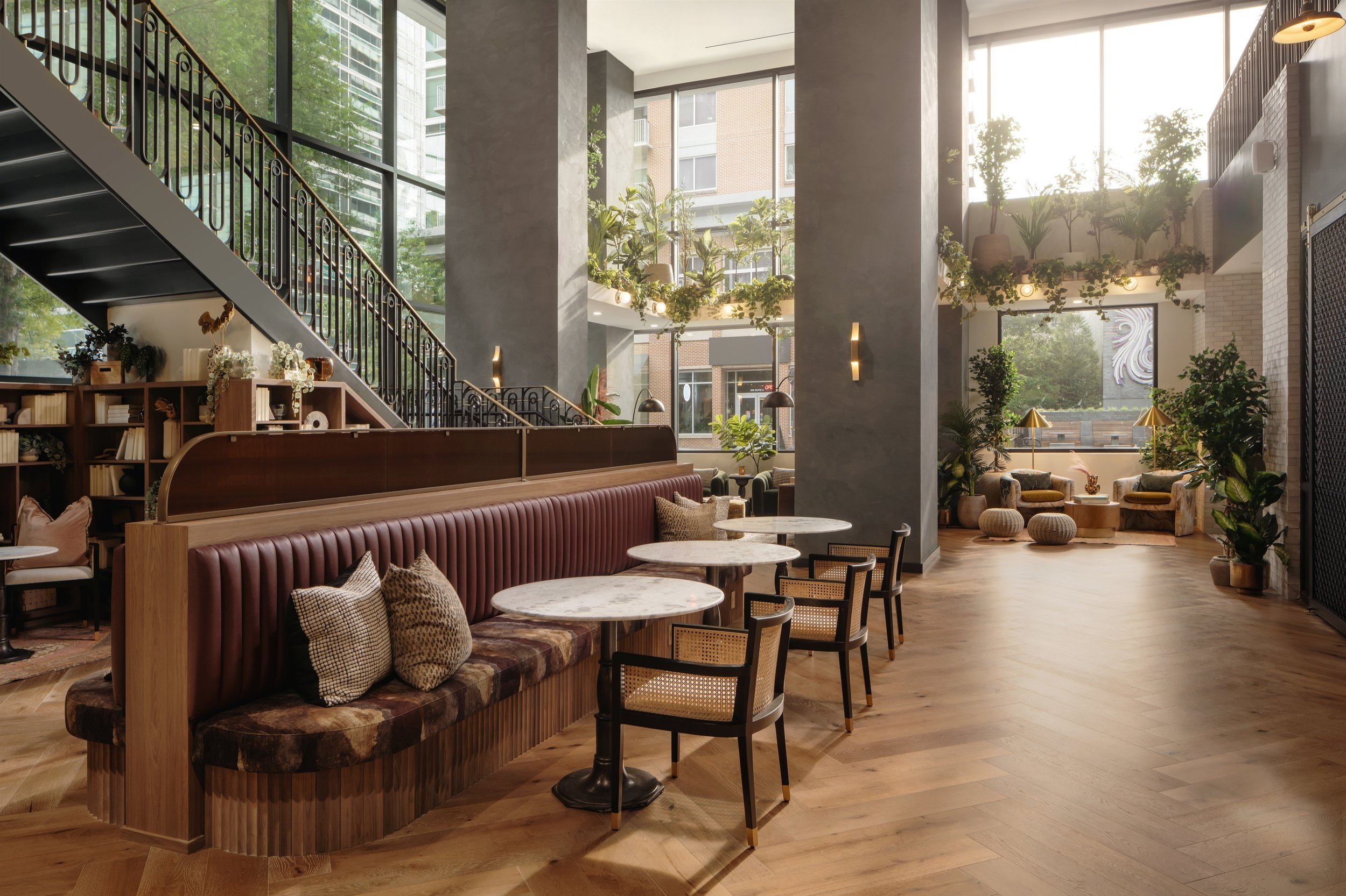
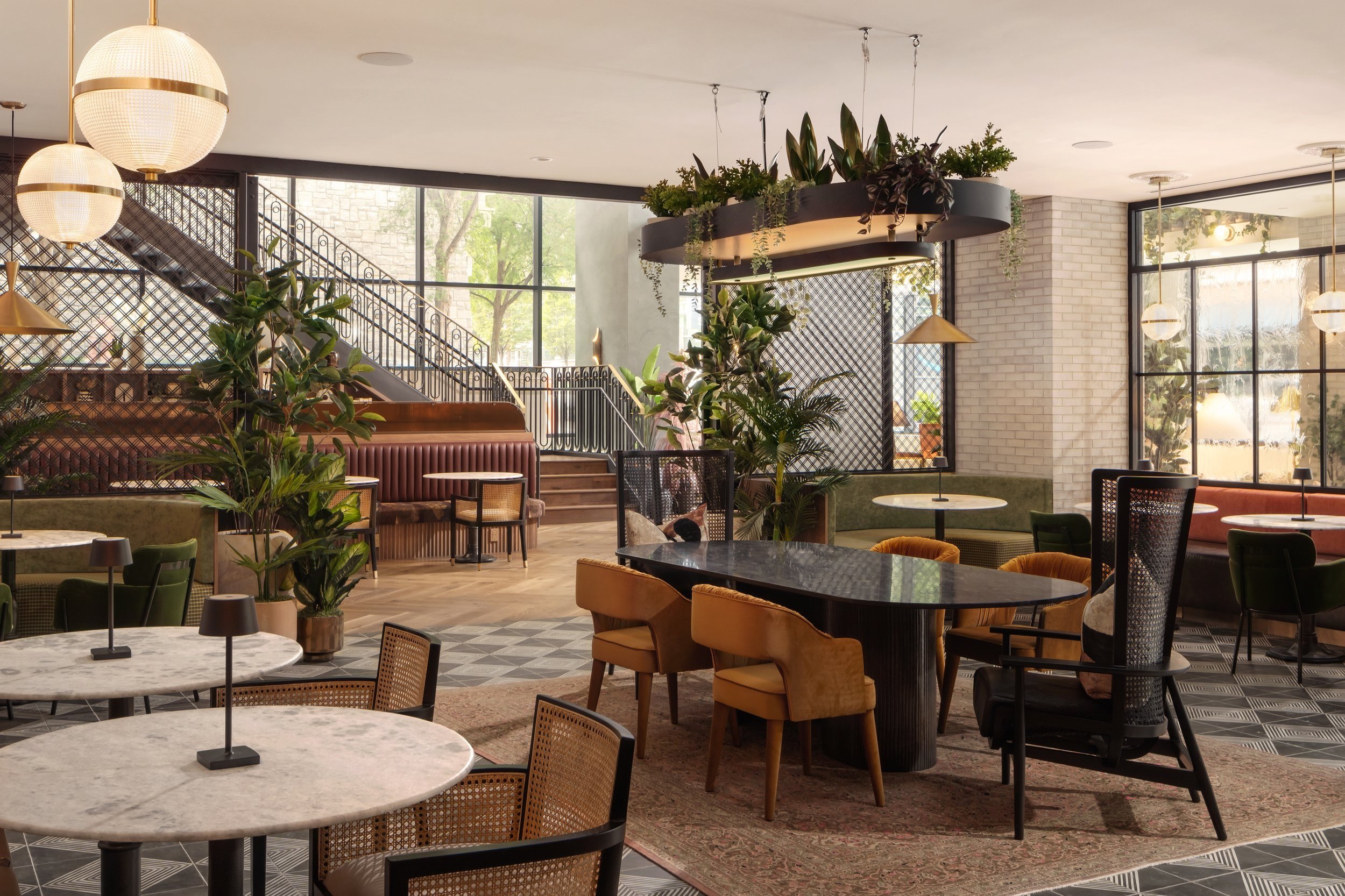
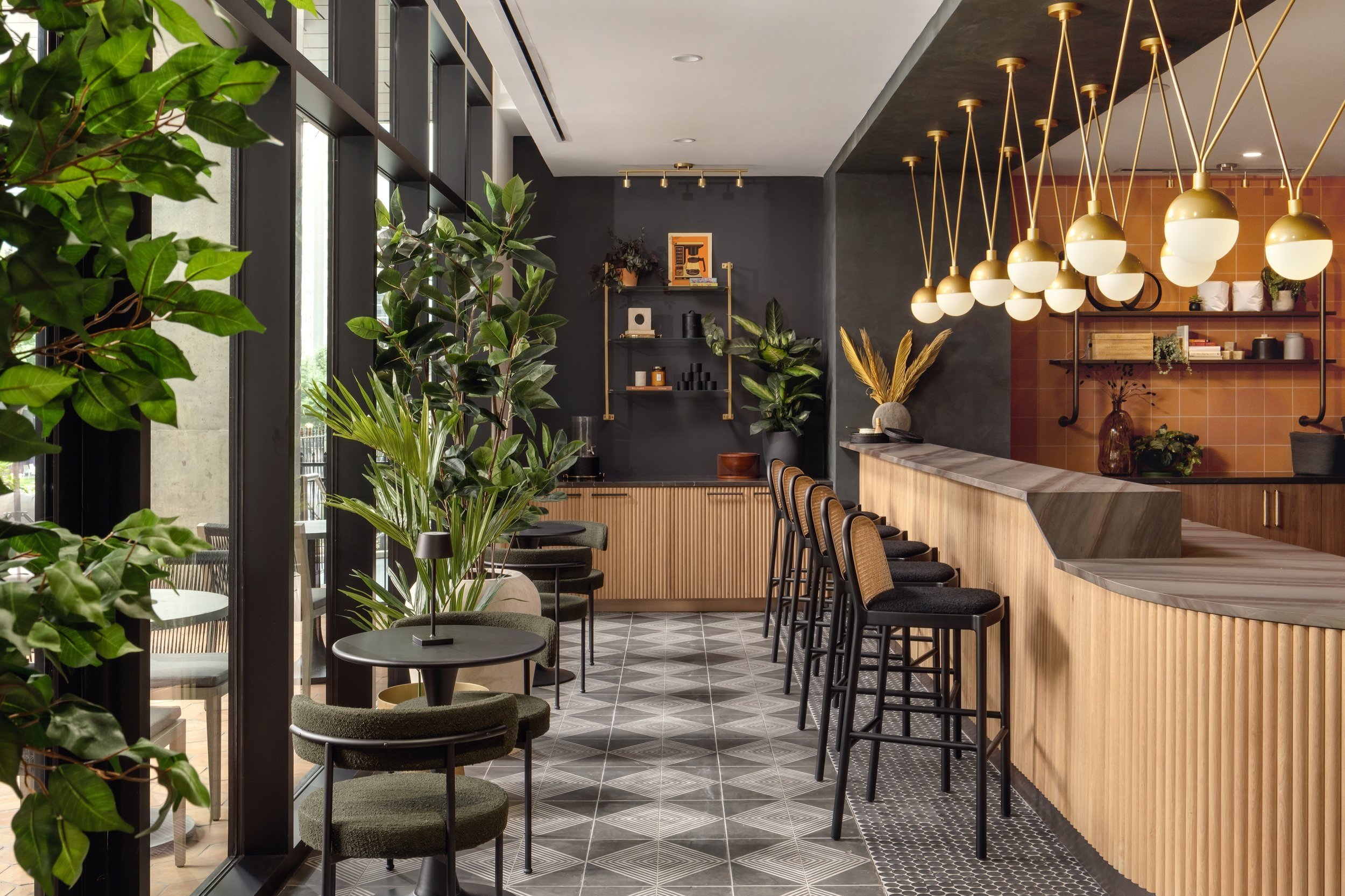
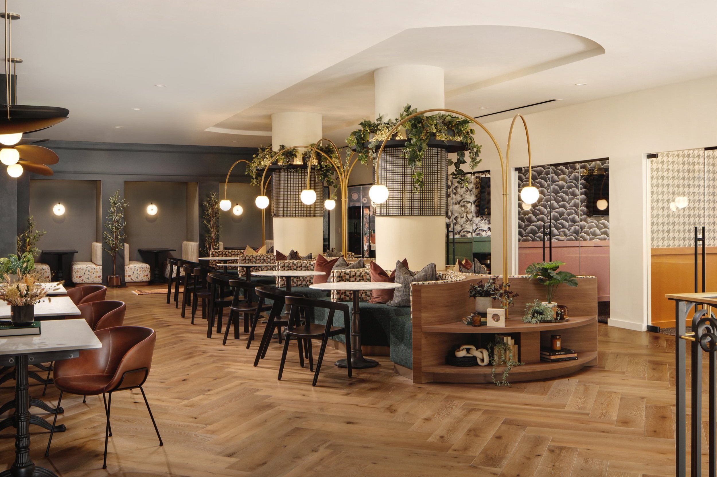
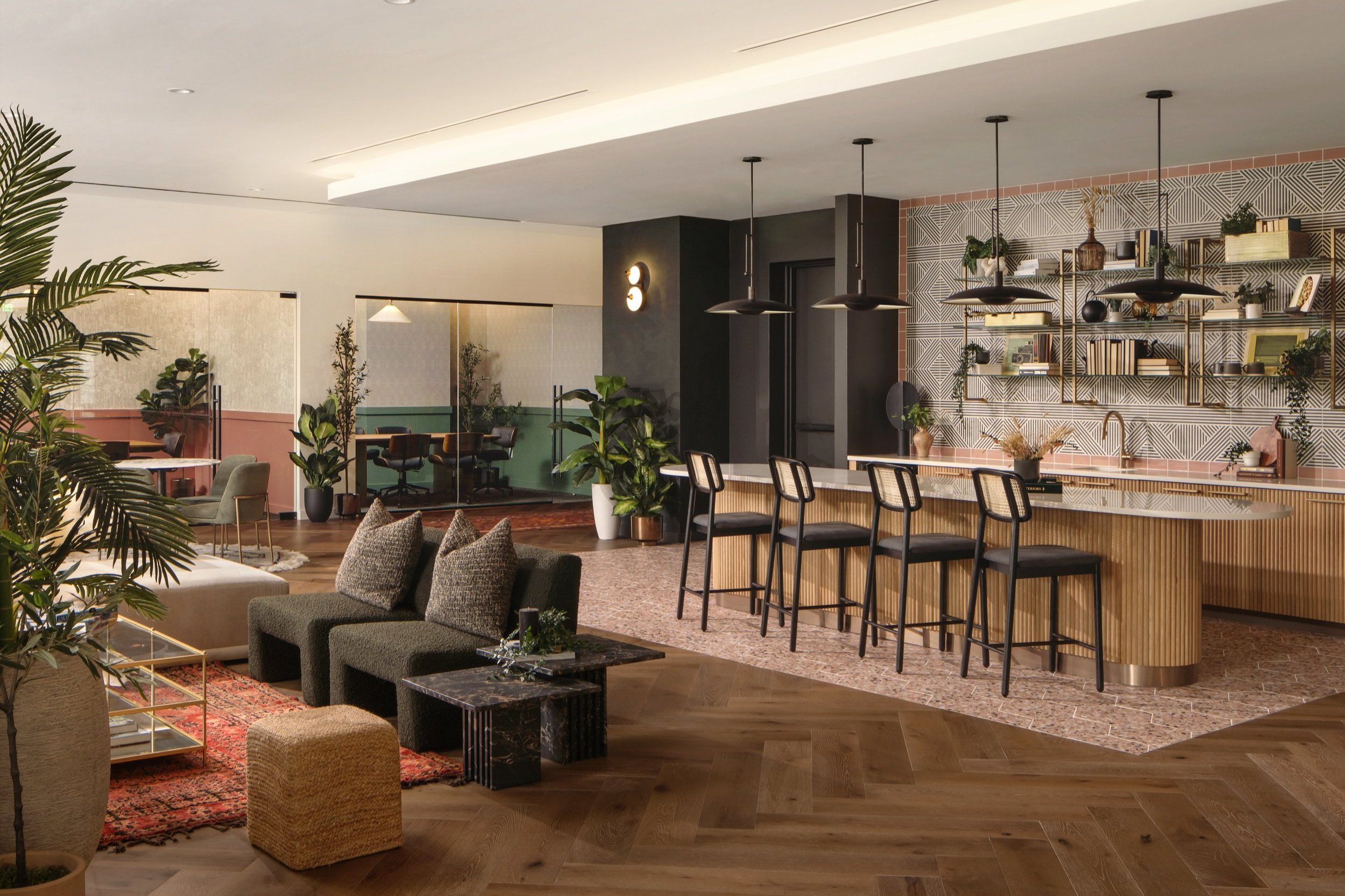
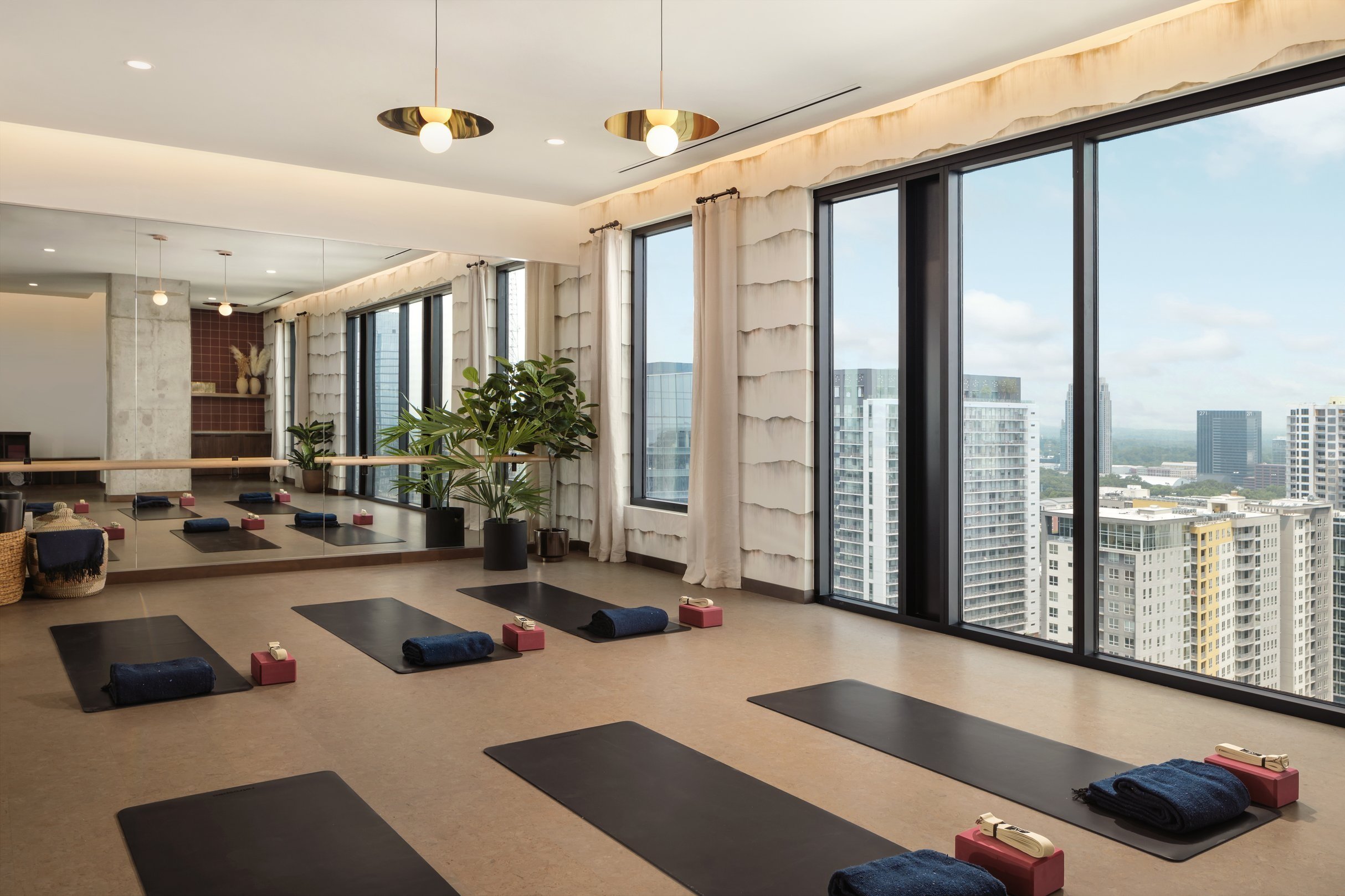
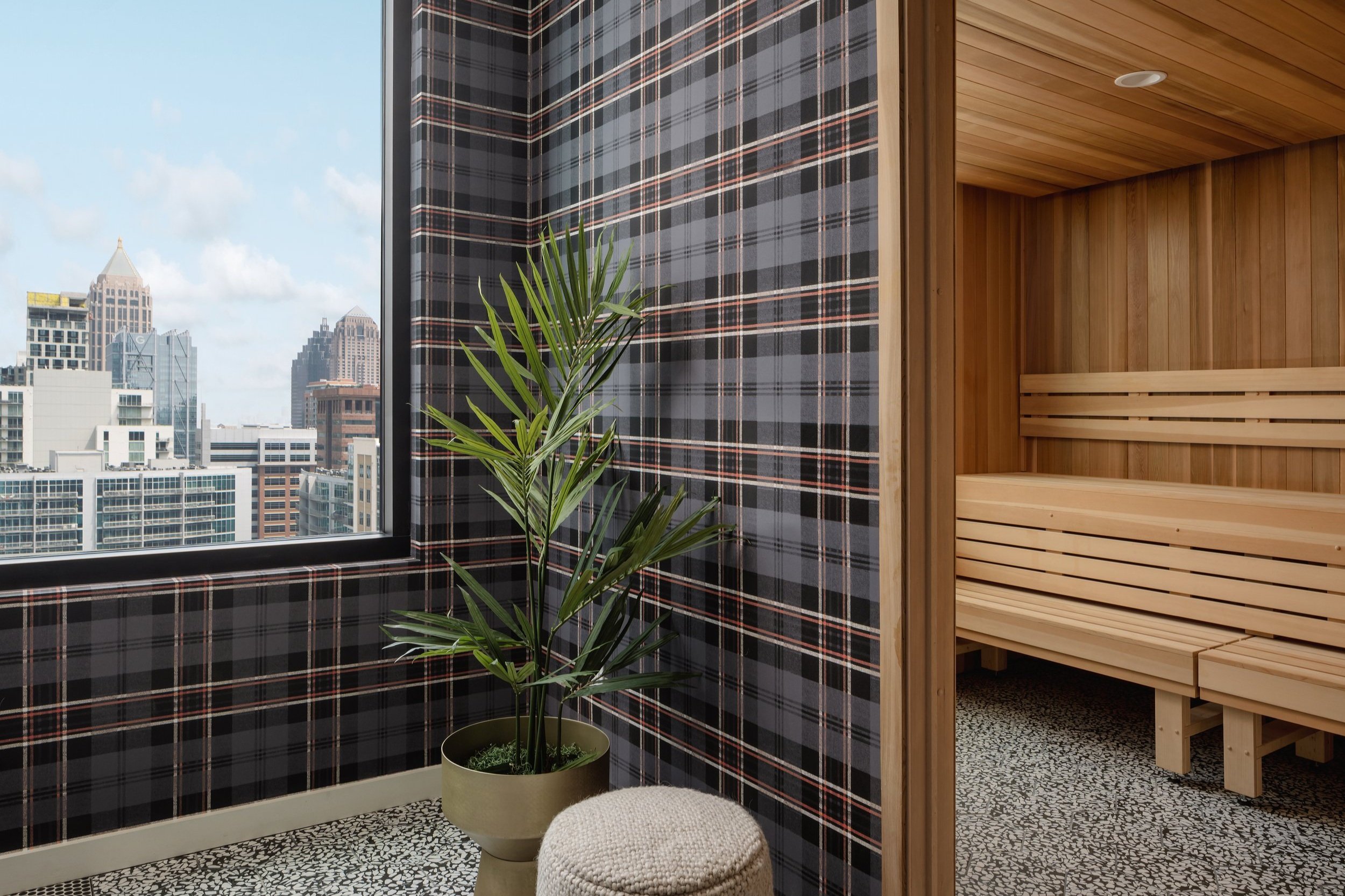
The site may be small, but the extensive, curated amenities starting from the ground-level and ending on the top floor, are reminiscent of a boutique hotel. Entering the warm and welcoming double-height lobby from the street, residents have access to the leasing office, mail room, lounge seating and an on-site Daydreamer café. Created by LV Collective, the integrated coffee shop also offers shaded outdoor seating to help with street presence and engage pedestrians. Walking up the stairs, ample private and group study spaces, podcast room, and a dog spa can be found on the mezzanine level. Taking the elevator past the next 23 residential floors, level 24 features penthouse units, a clubroom, two saunas, and a rooftop deck with grilling stations, an infinity edge pool and hot tub overlooking the city. When tenants step off the elevator on the 25th floor, they arrive at the expansive fitness center, which offers state-of-the-art equipment, yoga studio, spin studio and a unique fitness on-demand room with two interactive mirrors. The fitness center makes up the entire top floor, and the unbeatable views of Atlanta are more than enough to keep residents motivated during their workouts.
Ready for Georgia Tech’s Fall 2023 semester, Whistler is the popular new kid on the block with 96% of the building already leased in its first year pre-opening. The property accomplishes the city’s initiative to create a more walkable, bike-friendly environment within Midtown, while providing students unmatched amenity spaces and views of the city and campus.
whistler PROJECT TEAM:
Developer: LV Collective
Architecture: Niles Bolton Associates
General Contractor: JE Dunn Construction
Mechanical & Plumbing: ENGR3 Consulting Engineers
Electrical: Power Design
Structural Engineering: SCA Consulting Engineers
Interior Design: Variant Collaborative
Civil Engineering: Kimley-Horn and Associates, Inc.
Landscape Architecture: Ironwood Design Group, LLC
Photographer: Chase Daniel Photography

